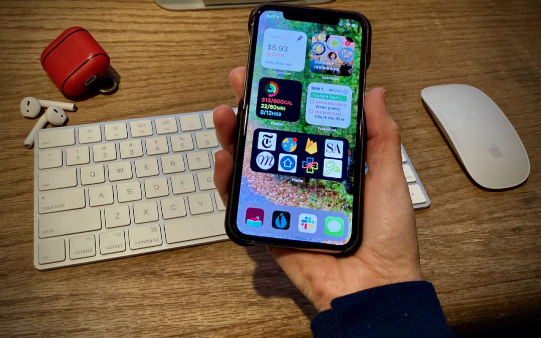
A significant new feature in iOS 14 is Home screen widgets, information-rich tiles that share space on a Home screen with app icons. iPhone users familiar with Google’s Android smartphone operating system have long clamored for widgets because they provide quick information at a glance, without having to launch an app or swipe right on the Home screen for Today view.
In fact, you could think of iOS 14’s Home screen widgets as having escaped Today view—which is still there and provides access to a scrolling list of widgets that you choose. Widgets do need to be updated for iOS 14 to live on the Home screen and appear at the top of the Today view list. Older widgets remain accessible at the bottom of Today view, and you can add and remove them by tapping Edit at the very bottom of the Today view screen.
Adding Widgets
To add a widget to a Home screen or to Today view (which, for the purposes of widget management, is just another Home screen), follow these steps:
- Touch and hold any empty spot on a Home screen until the icons start jiggling.
- Tap the + button at the top of the screen.
- In the Widget pop-up, scroll or search to find apps that offer widgets.
- Tap any widget to see its options; swipe left and right to see different sizes or types of information.
- Once you’ve found the widget size and content you want, tap Add Widget.
- Back on the Home screen, drag the widget to the desired location, which may involve dragging it to another Home screen or the Today view. Remember that you can instead swipe with another finger to move the screen underneath the widget while you’re dragging.
- After you position it as you want, tap Done in the upper-right corner (Face ID) or press the Home button (Touch ID).
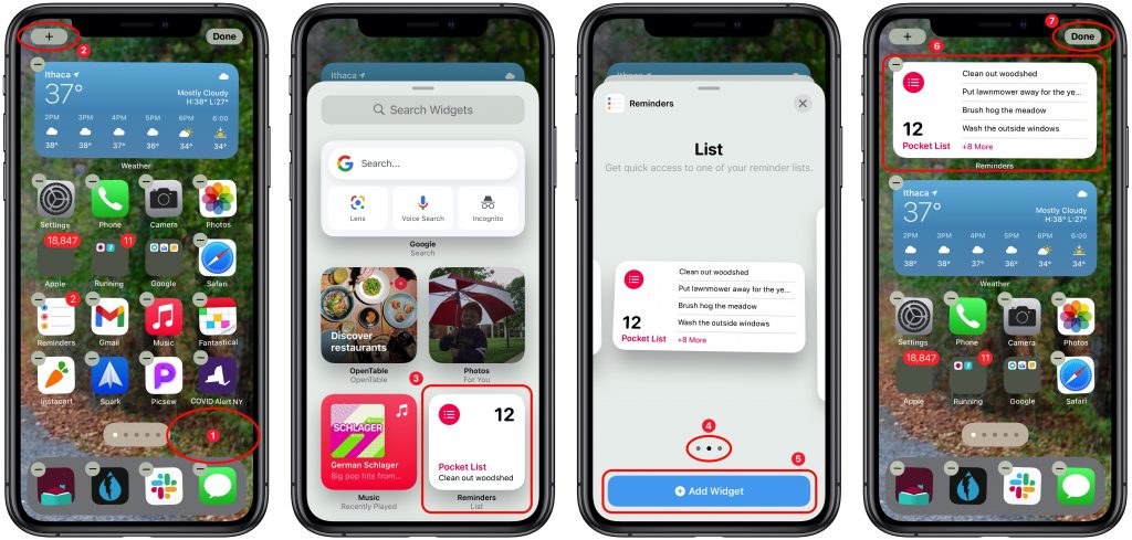
One tip: Other apps and widgets will move out of the way, which can be disconcerting, and it can result in your apps being shuffled around weirdly in the end. It’s safest to add widgets to an empty or nearly empty Home screen and, once you’ve gotten them configured as you like, move them to your final destination Home screen.
Choosing Widget Sizes and Types
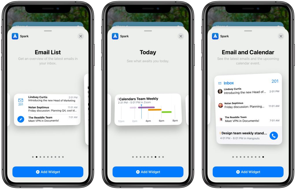
Widgets come in up to three sizes: a small square that occupies the space of four app icons, a horizontal rectangle that’s the size of two rows of apps, and a large square that takes up the space of four rows of apps. Plus, apps can provide multiple widgets, so the Spark email and calendar app, for instance, has nine different widgets that show recent email messages and upcoming events in a variety of layouts.
You might be thinking that widgets are cool but that they take up a lot of space. That’s true, and although nothing prevents you from having a bunch of Home screens devoted to nothing but widgets, you can also combine widgets into a stack. To do this, when you’re in jiggle mode, simply drag one widget onto another of the same size, much as you’d add an app to a folder. iOS 14 combines the two and, once you leave jiggle mode, lets you swipe up and down on the widget to move between them. You can add quite a few widgets to a stack, though at some point, it will become challenging to find the one you want.
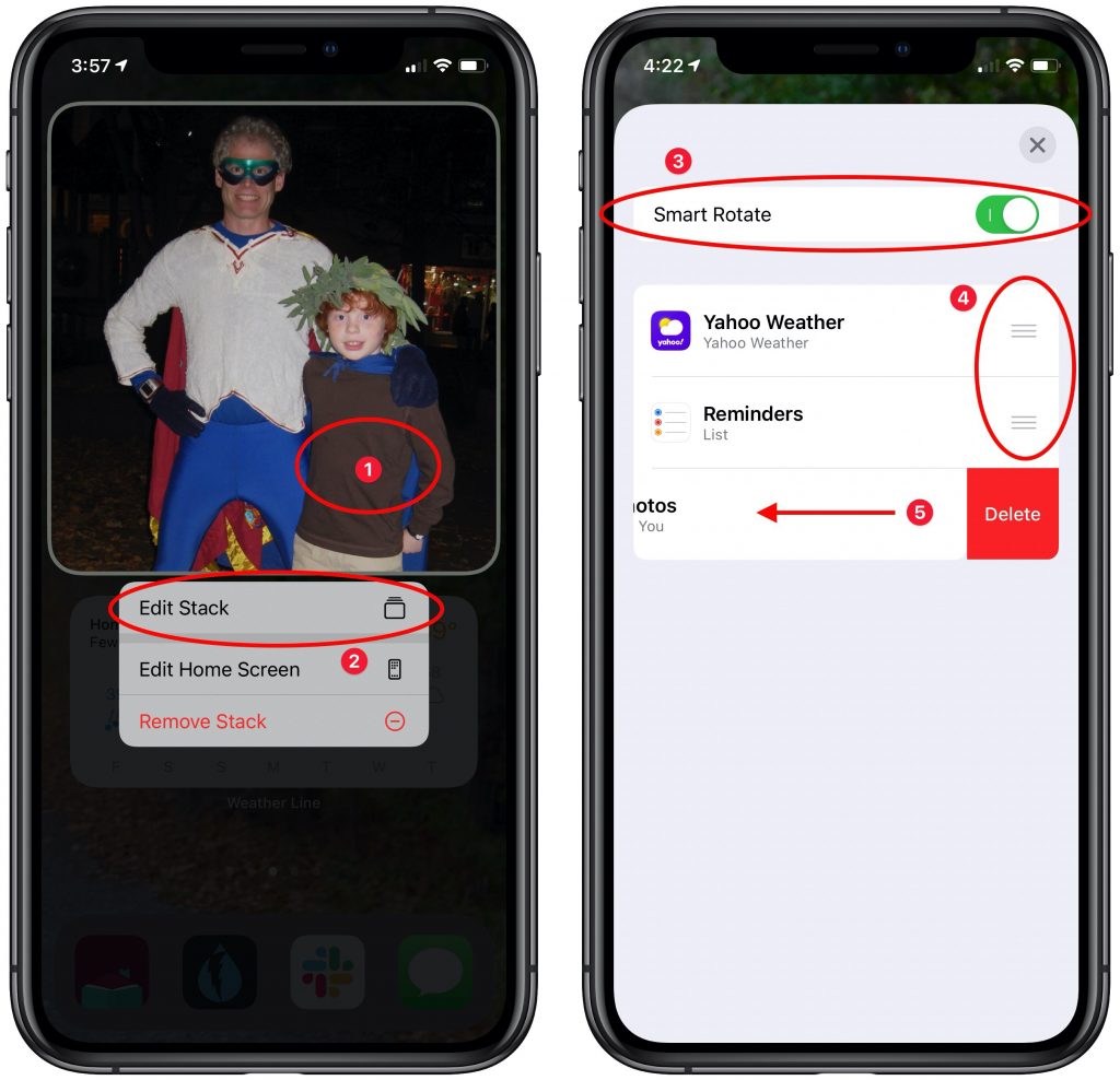
Stacks have another trick up their sleeve: Smart Rotate. When this option is enabled, the stack automatically displays the widget it thinks you’re most likely to want to see from the available set. How it chooses is a black box, so we can’t predict how well it will work for you. Smart Rotate seems to be on by default; if you want to check or turn it off, touch and hold on a stack ➊, tap Edit Stack ➋, and then toggle the Smart Rotate switch ➌. Note that you can also rearrange the order of widgets by dragging their handles ➍ and delete one directly by swiping left on it ➎.
For an Apple-mediated taste of what this might be like, consider adding a special type of widget: the Smart Stack, which always sits at the top of the otherwise-alphabetical list of apps that provide widgets when you’re looking for one to add. The Smart Stack widget, which is available in all three sizes, automatically populates itself with widgets that it thinks you’re likely to find interesting. It too employs Smart Rotate, and you can edit the Smart Stack just like one you’ve created.
Removing Widgets
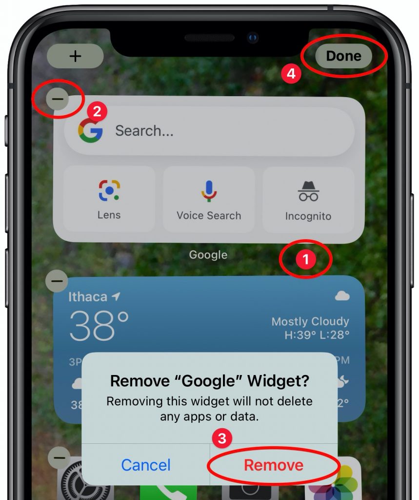 It will take some experimentation to hit upon a set of widgets that show the information you want, so don’t be shy about removing widgets or stacks that aren’t being helpful. To do so:
- Touch and hold any empty spot on a Home screen until the icons start jiggling.
- Tap the – button in the upper-left corner of a widget or stack.
- In the alert that appears, tap Remove. Repeat as desired.
- Tap Done in the upper-right corner (Face ID), or press the Home button (Touch ID).
You can also touch and hold a widget or stack and then tap Remove Widget or Remove Stack.
What’s most important about the new Home screen widgets in iOS 14 is that they’re completely individualized. No two iPhone users will even have the same widget choices, and as your favorite apps are updated for iOS 14, new widgets will appear. So take a few minutes to explore what’s available now, and be sure to check back every month or so.
Thanks for checking out the MacEdge blog.
(Featured image by Adam Engst)

