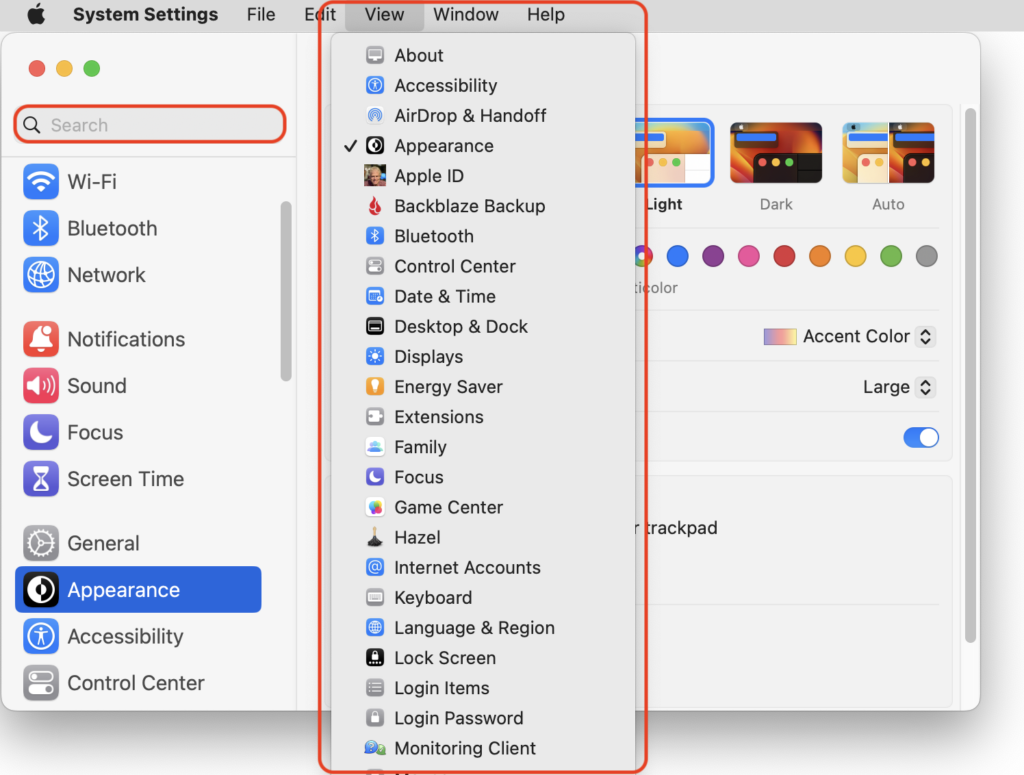
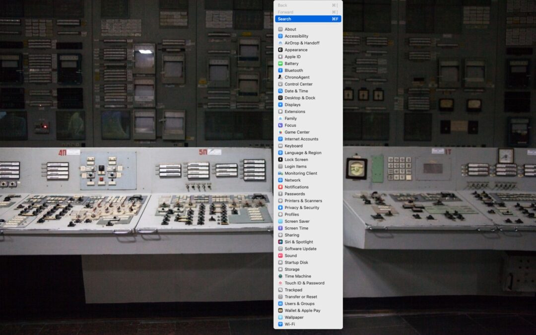
In macOS 13 Ventura, Apple replaced the creaky System Preferences with System Settings, which uses a more iOS-like interface. Many people find System Settings overwhelming, partly because they had memorized where to look in System Preferences (but System Settings has many other design flaws as well—it’s not your fault). We have two recommendations to make it more easily navigable. First, for an alphabetical approach, use the View menu, which lists the panes that way, along with the top-level items in the General settings pane. Second, make heavy use of the search field at the top of the System Settings sidebar—it’s the only way to find some deeply nested settings.

Thanks for reading the MacEdge blog.

